How to have a div with rounded corners using CSS + Generator CSS
Tutos - 21/06/2015
1. CSS code for style
The CSS code is not quite short like a single snippet of code to copy / paste. It is due to the fact that there is common directives between browser editors to be supported. In the doubt, I think that we should integrate all ^^. No but more seriously we will see in detailed which attribute is for which browser.
.div_with_round_corners{
	border-radius:10px;
	-webkit-border-radius:10px;
	-moz-border-radius:10px;

	background-color:#EFEFEF;
	padding:10px;
	width:100%;
	text-align:left;
}
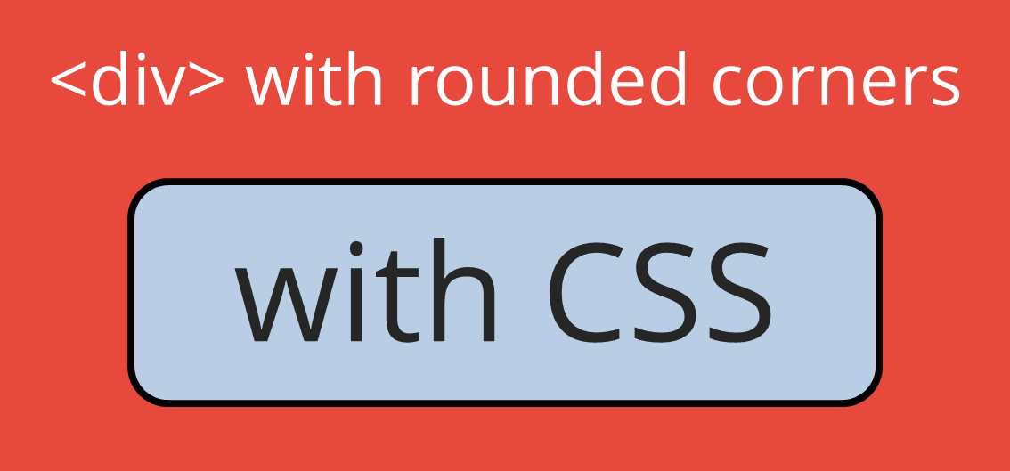
2. Result
Here is my div content. I also added padding so the text doesn't touch the border of the div. It eases the reading.
Details on the different attributes related to the rounded corners
border-radius: This property is taken into account by CSS3.-webkit-border-radius: This property is taken into account by Safari & Chrome.-moz-border-radius: This property is taken into account by Mozilla.-o-border-radius: This property is taken into account by Opera. But it doesn't seems to be the case anymore. It should beborder-radiusinstead.-khtml-border-radius: This property is taken into account by Konqueror. As for the previous attribute, it doesn't seems to be the case anymore butborder-radiusinstead.
3. Different size of radius on the same div
Here is an example where we have rounded corners only on the top right end and the bottom left end. The customization is really easy to use but it still have to be detailed for each browser.
.div_shape_1 {
	border-top-right-radius: 30px;
	border-bottom-left-radius: 30px;
	-webkit-border-top-right-radius: 30px;
	-webkit-border-bottom-left-radius: 30px;
	-moz-border-radius-topright: 30px;
	-moz-border-radius-bottomleft: 30px;
	height:80px;
	width:80px;
}

.div_shape_2 {
	border-top-left-radius: 10px;
	border-top-right-radius: 20px;
	border-bottom-right-radius: 30px;
	border-bottom-left-radius: 40px;
	-webkit-border-top-left-radius: 10px;
	-webkit-border-top-right-radius: 20px;
	-webkit-border-bottom-right-radius: 30px;
	-webkit-border-bottom-left-radius: 40px;
	-moz-border-radius-topleft: 10px;
	-moz-border-radius-topright: 20px;
	-moz-border-radius-bottomright: 30px;
	-moz-border-radius-bottomleft: 40px;
	height:80px;
	width:80px;
}
Result
Shape 1
Shape 2
It is probably obvious with the example "Shape 2" that each corner can have its own radius and more importantly what are the attributes to do it.
Just to make sure here is the list on the attributes by corner :
| Main attribute | Derivative for each corner |
|---|---|
| border-top-left-radius | border-top-left-radius border-top-right-radius border-bottom-right-radius border-bottom-left-radius |
| -webkit-border-radius | -webkit-border-top-left-radius -webkit-border-top-right-radius -webkit-border-bottom-right-radius -webkit-border-bottom-left-radius |
| -moz-border-radius | -moz-border-radius-topleft -moz-border-radius-topright -moz-border-radius-bottomright -moz-border-radius-bottomleft |
4. Circle and Oval
It is also possible to go up to a disk or an oval shape.
.circle_div {
	border-top-right-radius: 20px;
	-webkit-border-top-right-radius: 20px;
	-moz-border-radius-topright: 20px;
	height:40px;
	width:40px;
}
.oval_div {
	border-radius: 100px / 50px;
	-webkit-border-radius: 100px / 50px;
	-moz-border-radius: 100px / 50px;
	width: 200px;
	height: 100px;
}
Result
Circle
Oval
Borders only
Of course all the shapes that we have seen can be used to draw only the border.Shape 1
Shape 2
Circle
Oval
CSS code generator
Finally and to make life easier, we added a tool to automatically generate CSS code for your div. You just have to set the radius in pixels that you want for each corner and it will automatically give you the code for the entire the div. Obviously, this is an automatic result that can be optimized depending on the result you expect.px
|
px
|
|
px
|
px
|
Conclusion
To summarize briefly, in this tutorial, we saw how to create div with rounded corners. We have seen how having a different radius for each corner, and also how to make our code working with most browsers.
Pierrick CUSSET
Autodidact passionate about the web, I'm always looking for new challenges.
Founder of Online-Free-Tools.com.
Comments
No comment
 FR
FR
 EN
EN